Wellow Socks
Client
Wellow Socks
Duration
4x(2-Week Design Sprint)
Focus
Optimize the Core User Flow → Checkout · Homepage · Subscription · Mobile UX
Our objective was to transform Wellow from a functional utility brand into a premium wellness lifestyle flagship. By merging high-performance e-commerce with a soft, editorial aesthetic, we aimed to simplify the compression education process and create a frictionless path to purchase that mirrors the comfort of the product itself.
- Category Shift: Moving from a clinical ``medical`` look to a premium lifestyle and wellness aesthetic.
- Technical Clarity: Simplifying complex compression and bamboo fabric benefits into visual modules.
- Streamlining Choice: Reducing ``choice paralysis`` across various heights, sizes, and compression levels.
- Scaling AOV: Redesigning the cart to intuitively drive bundle adoption and ``Buy More, Save More`` behavior.
- Mobile Velocity: Optimizing for a social-first audience with high-speed, thumb-friendly navigation.

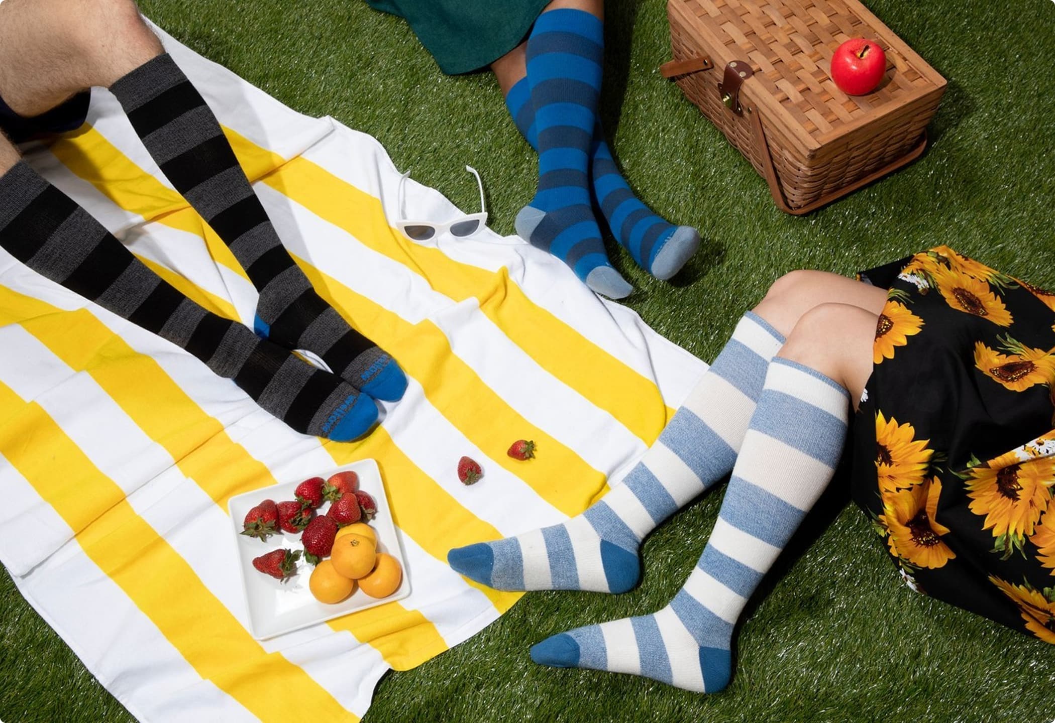
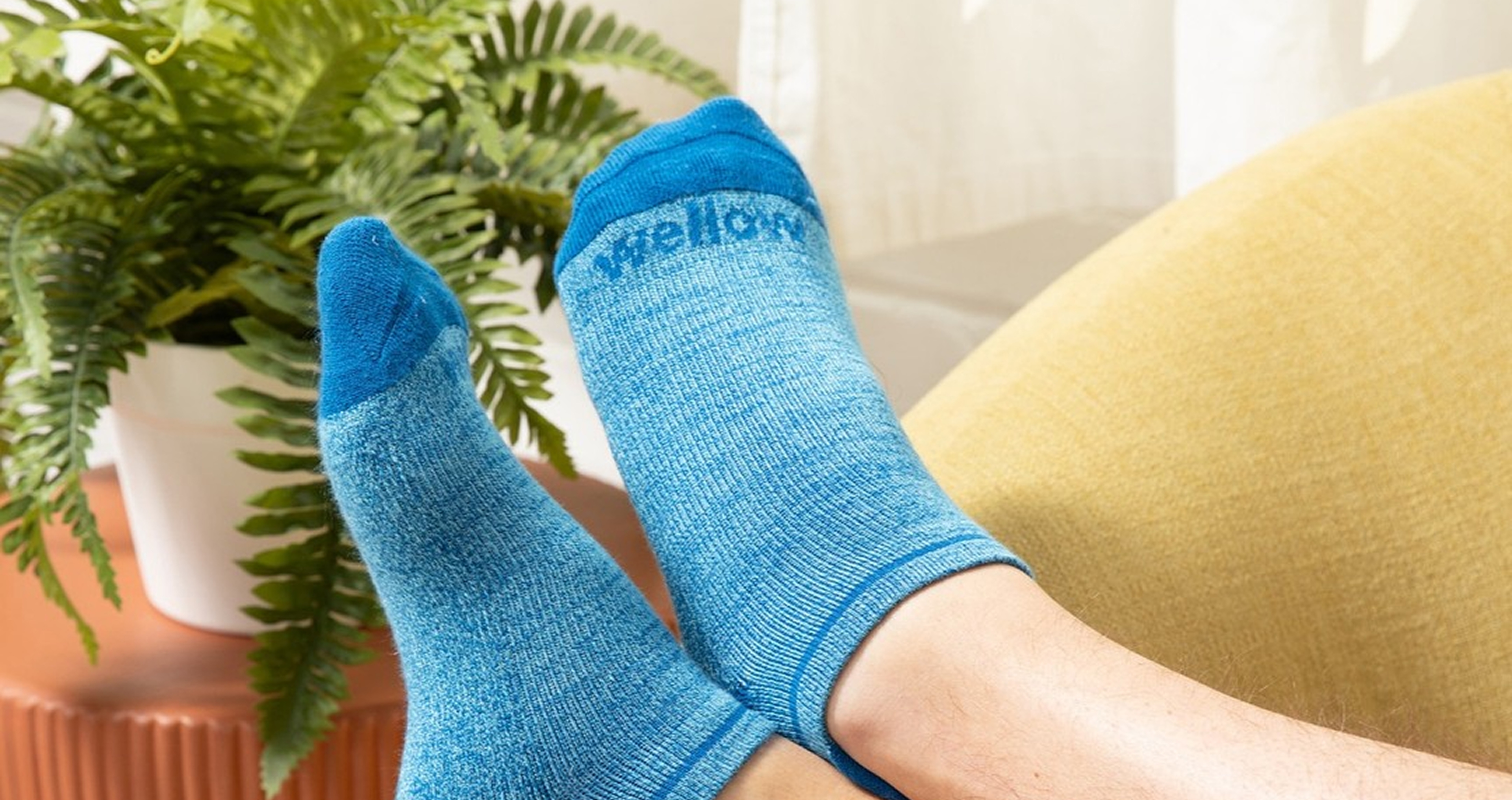
Elevating the Everyday
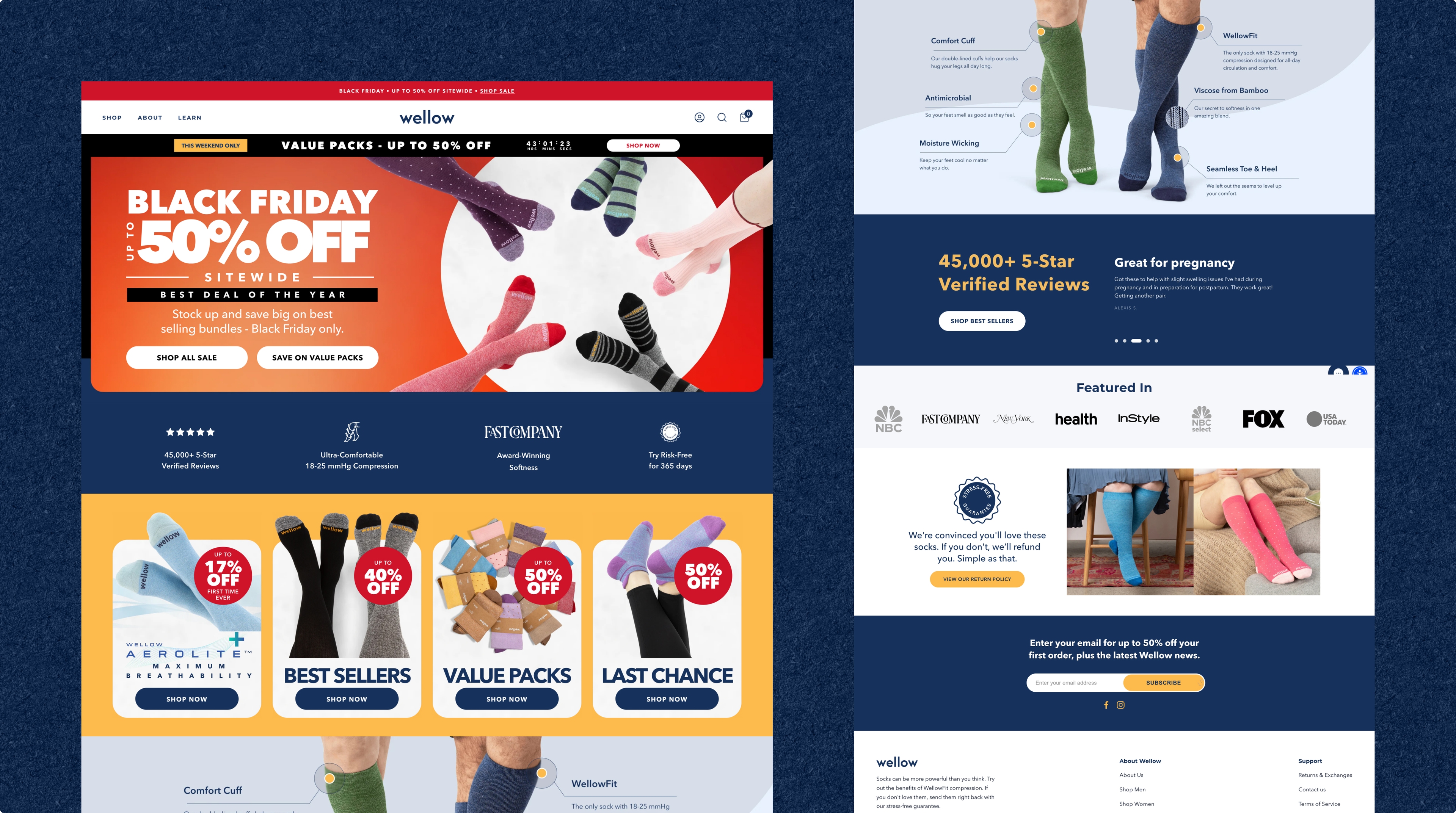
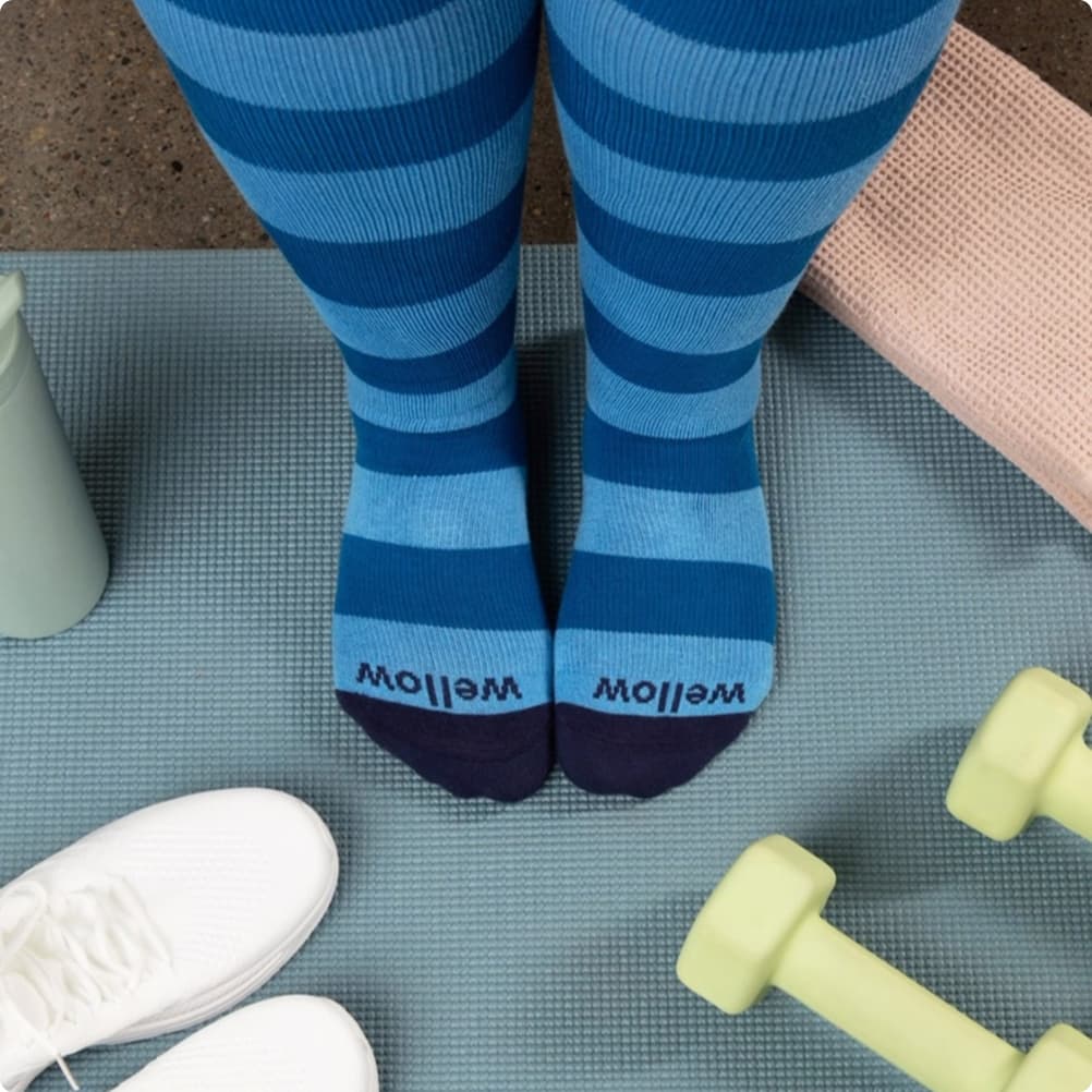
We utilized a palette of soft earth tones and high-energy lifestyle photography to position Wellow not just as a sock, but as a catalyst for an active, pain-free life.
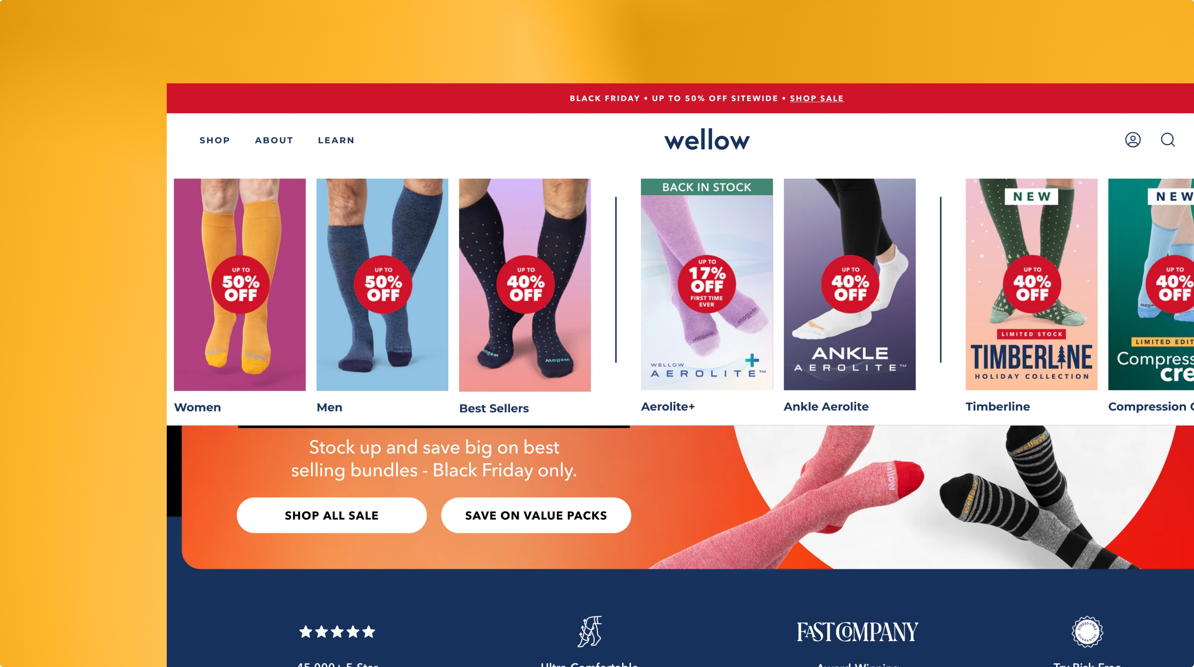
The Collection Experience
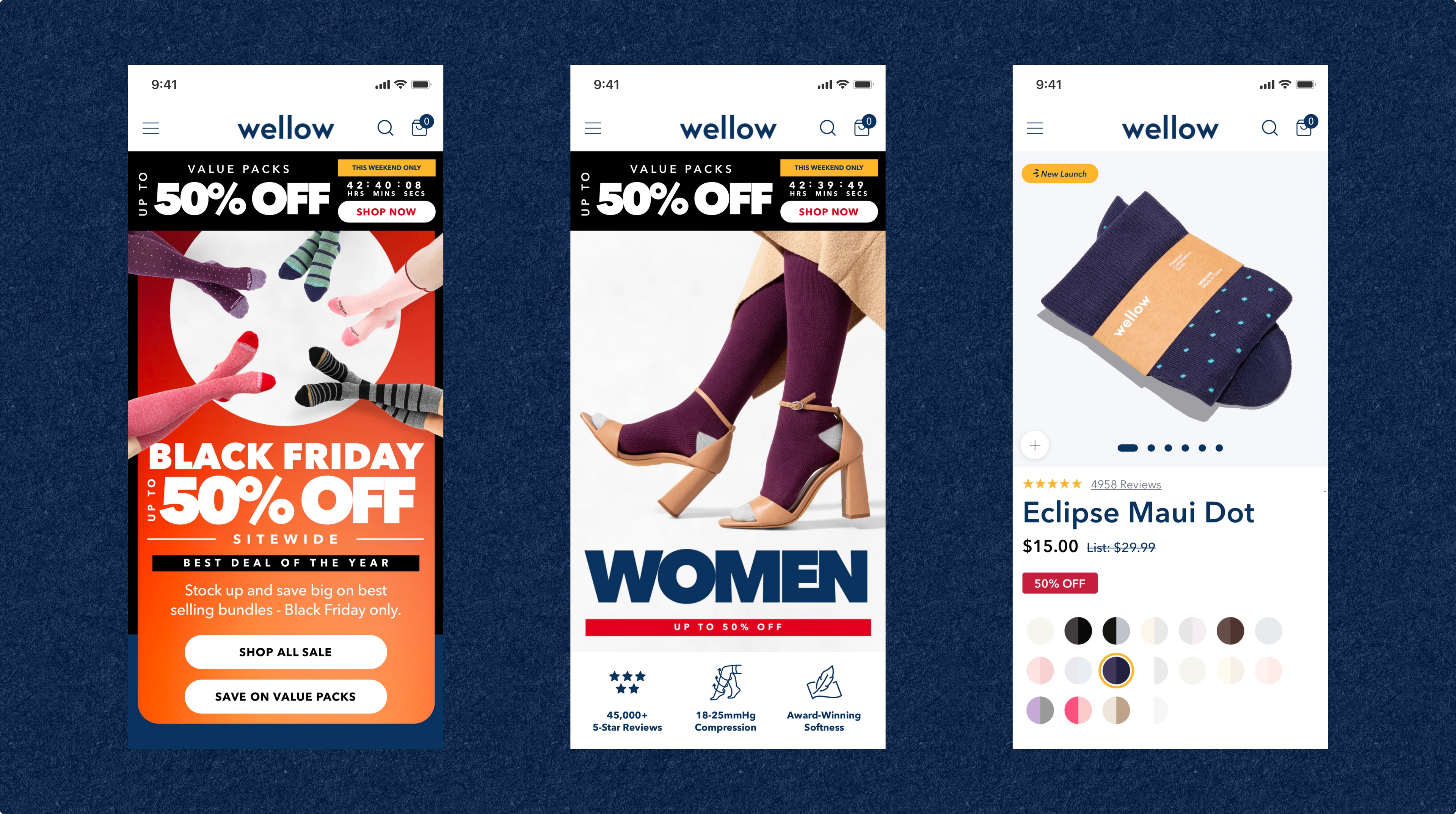
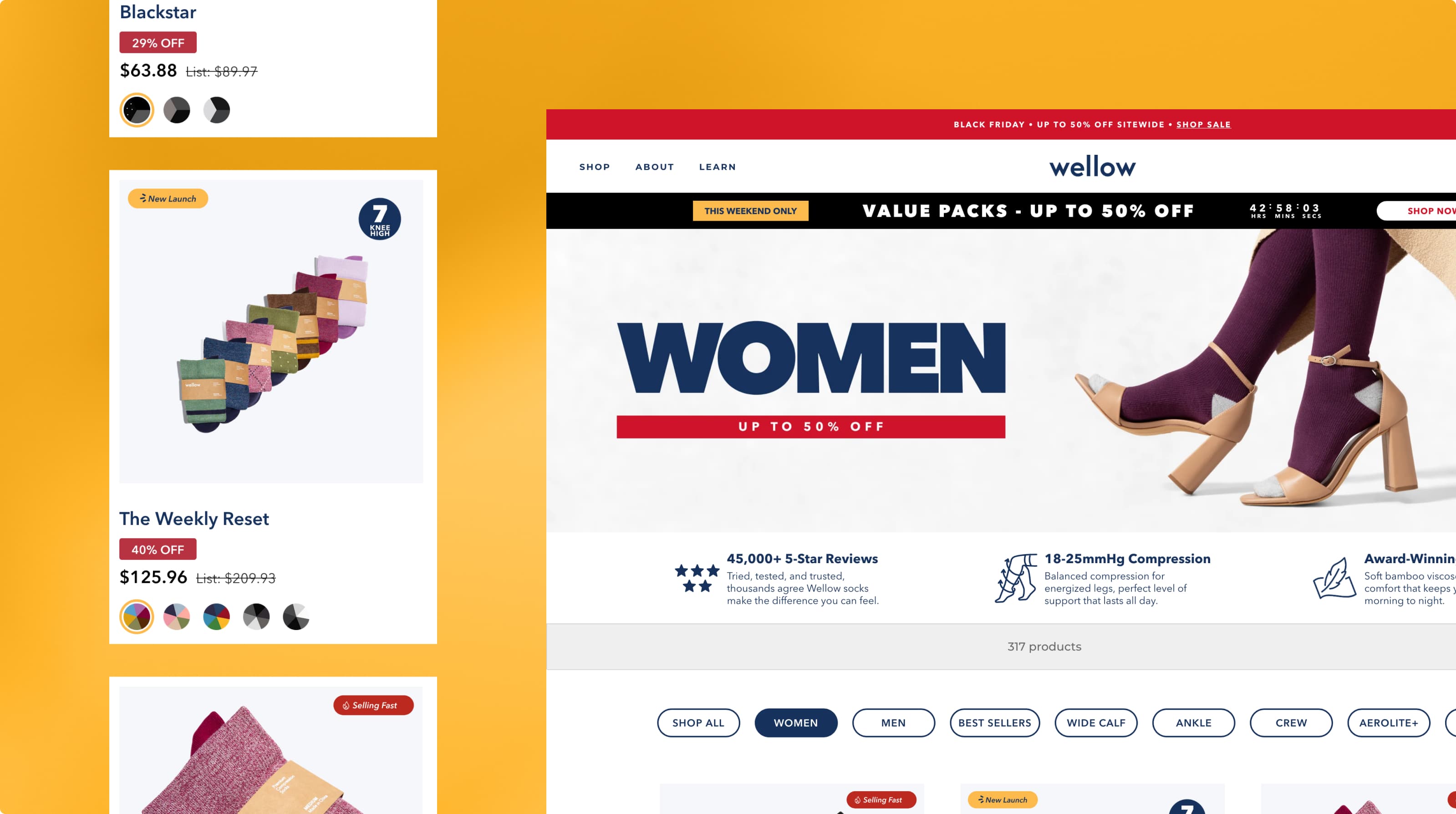
We streamlined the browsing experience by allowing users to filter by compression level, height, and color seamlessly, reducing the cognitive load on new customers.
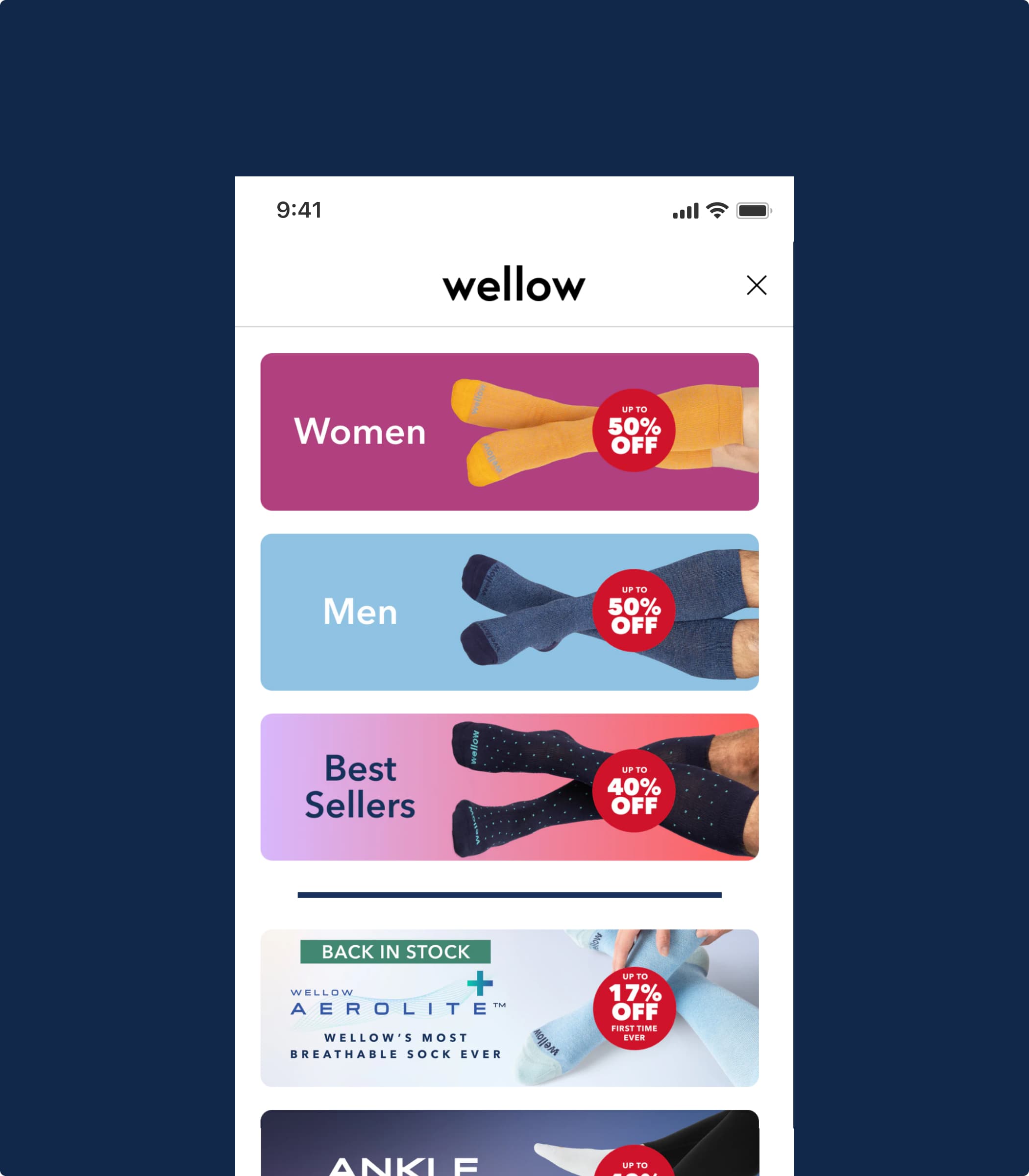
The mobile interface was designed for thumb-ready navigation, featuring a persistent ``Add to Bag`` bar and quick-view product details.
Converting comfort into a seamless commitment.
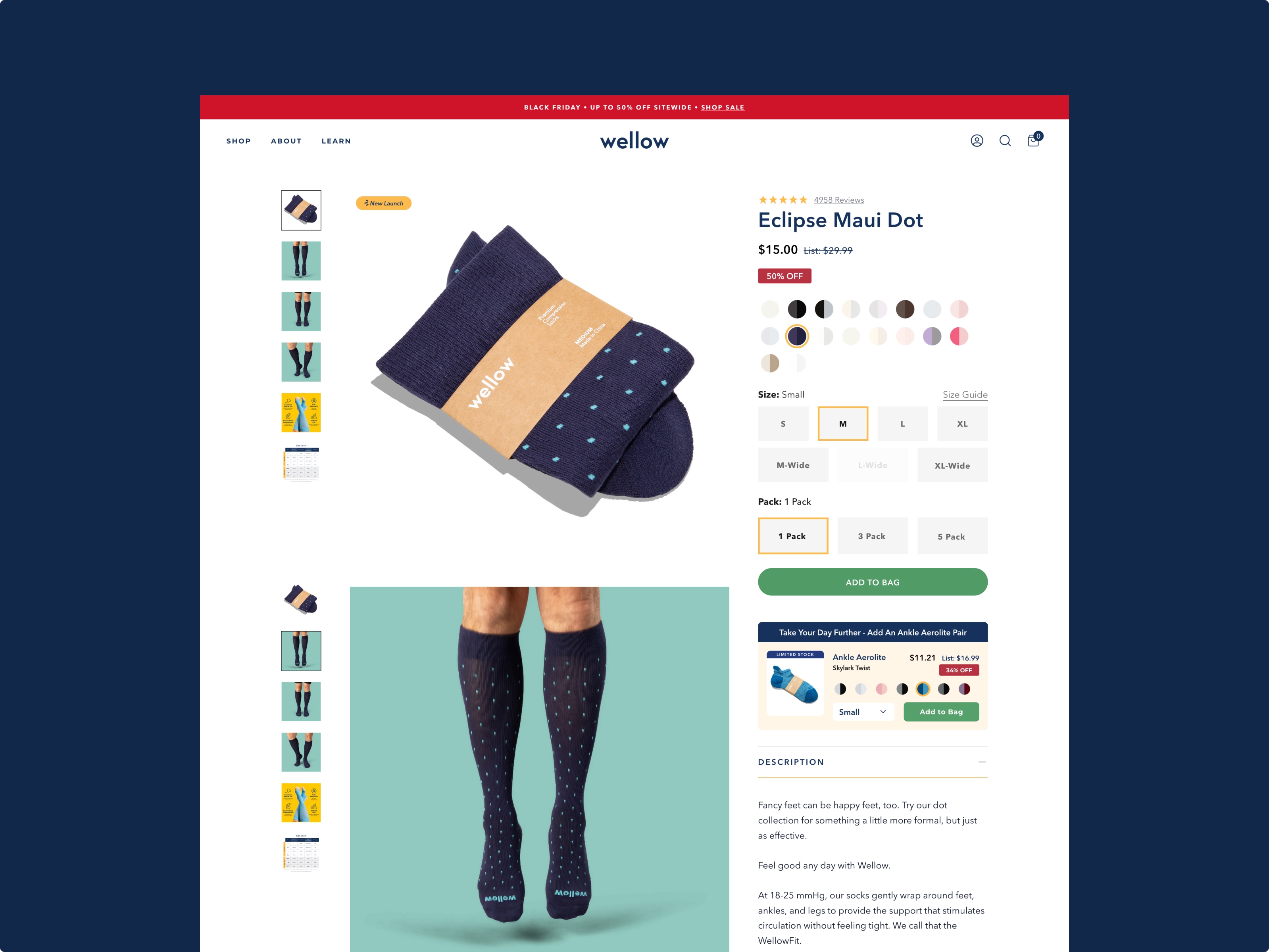
To accelerate the path to purchase for a high-frequency wellness essential, we focused on removing the friction of technical selection. By implementing a ``Quick-Add`` functionality directly within the collection grid and a persistent sticky-ATC bar on mobile, we enabled users to select size and color without leaving their discovery flow. We integrated dynamic bundle progress bars within the cart, leveraging the ``Buy More, Save More`` psychology to drive an immediate +31% increase in Add-to-Cart rates for multi-pack orders.
PDP Strategy
We broke down complex compression technology into digestible, visual modules. By focusing on ``Benefits over Specs``, we helped customers understand the why behind the weave.
We used playful colours, engaging illustrations, and micro-interactions to weave the brand through the experience and draw visitors in.
The new site feels multi-dimensional — much like the mind.
The Bundle Builder
To drive AOV, we designed a tiered rewards system directly within the slide-out cart, incentivizing users to ``Complete the Set`` and unlock free shipping or discounts.
A Breath of Fresh Air:
The final interface is clean, breathable, and supportive - mirroring the product itself.